Long time knit along sponsors of ours - Pom Pom Quarterly are back again with a fascinating and interesting look behind the patterns in their newest issue! As a knitwear designer who is inspired by things such as books, music, scenery, art etc. I couldn't get enough of this post! I love seeing mood boards and where designers are drawing inspiration from! Such a cool idea and one I thought you'd all be interested in as well. Pom Pom shares some of the tops in the newest issue and a bit history of the artwork they were inspired from! I think this issue of Pom Pom (Summer 2018) is my fave one yet! If you haven't seen it don't miss it! Every pattern is fab and the tops in this issue are all gorgeous!
Here's Pom Pom....
Every issue of Pom Pom starts with a mood board. Months before the magazine makes it into your hands, our editors (Lydia & Meghan) gather images that capture the visual story they imagine to share with designers. To get inspired with ideas for new patterns, they often look at how artists use colours, textures, and patterns related to the issue’s theme, even when the artwork has nothing to do with knitting.
Our summer issue’s theme is stripes and the pattern names reference some fantastically stripe-happy artists. We are so grateful to Shannon for the chance to share more about these amazing artists and hopefully help you find inspiration in choosing your Tops, Tanks & Tees! Have a look at how the artists have used colours and stripes to see if there’s a combination or effect you’d like to replicate with the yarns you choose for your project.
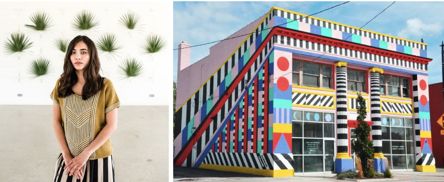
LEFT: Leiden by Natalie Selles / RIGHT: Camille Walala, Pop Life Building (2017)
LEFT: Camille Walala, In Da House No. 2 (2015) / RIGHT: Leiden by Natalie Selles
One of our earliest inspirations was London-based Camille Walala. Her eye-popping murals cover entire buildings from Vancouver to Mauritius. Nearer Pom Pom HQ in London, she has decorated clothing, canal boats, crosswalks, mazes; you name it! We love Walala’s playful, fearless approach to combining bold lines and patterns with unexpected colours. Maybe you can spot some Walala influence in the graphic front panel on Natale Selles’ Leiden tee? We see crisp lines, strong colour and contrasting stripe patterns!
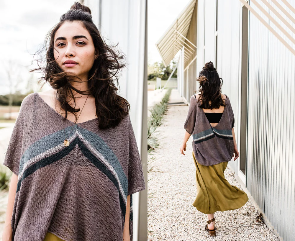
The striped band of Paula Pereira’s slouchy linen top Herrera made us think of Carmen Herrera’s (B. 1915) clean lines and bold expanses of colour. Although she had painted since the 1940s, Herrera struggled to sell or even exhibit her paintings before 2004, when she was 89!!! With its hard edges and aggressive colours, her work was considered overly masculine for a woman artist. Herrera continued to paint in isolation until the tide turned and curators became interested in geometric abstraction among women. Today, at 103-years-old, Herrera is recognized as a major Minimalist painter and an emblem of persistence. Take a page out of Carmen Herrera’s book and go bold and flat with your choices here! Bands like this are a great chance to pick a wild colour you love but would otherwise struggle to wear.
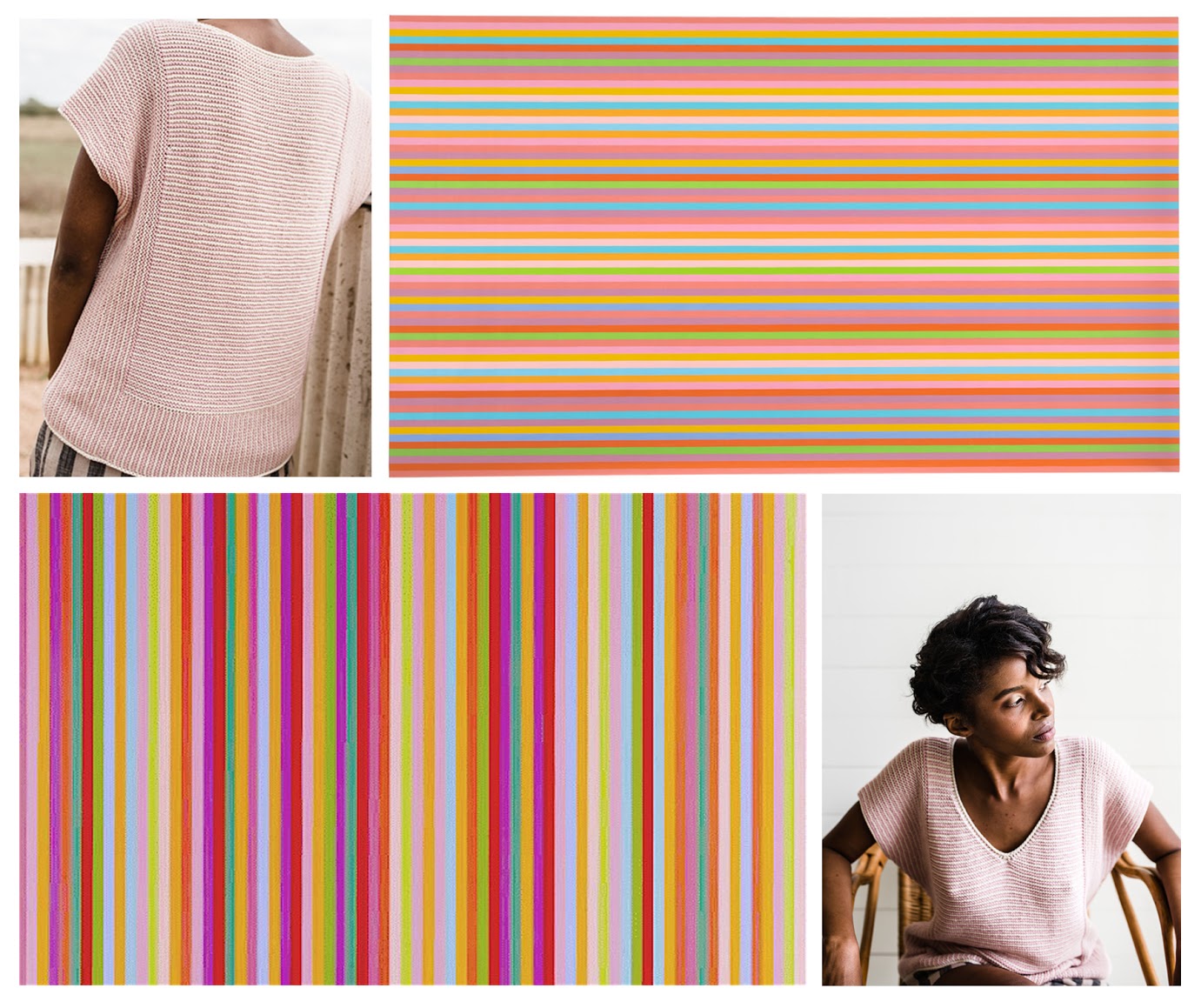
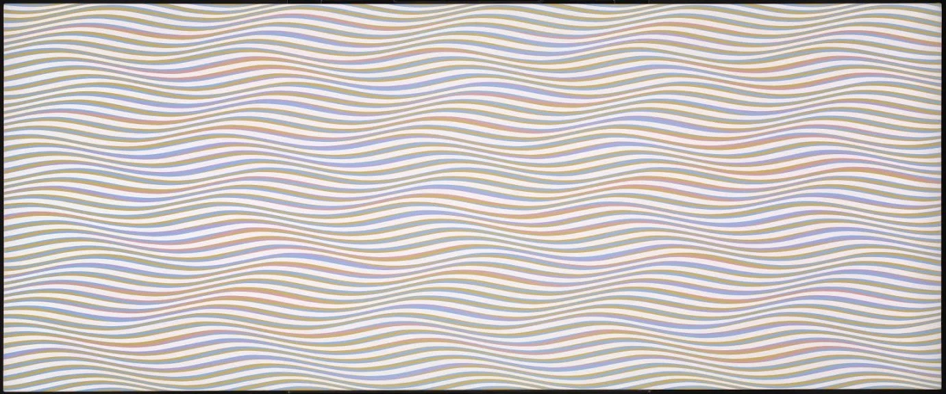
Top left and bottom right: Riley tee by Amy Christoffers / Top right: / Bottom left: Bridget Riley, Sarabande (1985)
Top left: Bridget Riley, Cataract 3 (1967) / Top right and bottom left: Riley tee by Amy Christoffers / Bottom right: Bridget Riley, Orphean Elegy 5 (1979)
Our Riley tee takes its name from Bridget Riley (B. 1931), whose stripe paintings have made her a leading figure of Op Art since the 1960s. Her paintings often use stripes to create optical illusions of movement on a solid surface. Stripes appear to move or vibrate as Riley manipulates our perception through subtle variations in the colour, tone, rhythm and weight of simple lines. The softly blending colours and crisp lines of Amy Christoffers’ log cabin modular stripes felt like a clear match. Flat or rumpled a bit as it’s worn, Riley’s plump and lustrous contrasting yarns really recreate the effect of the paintings.
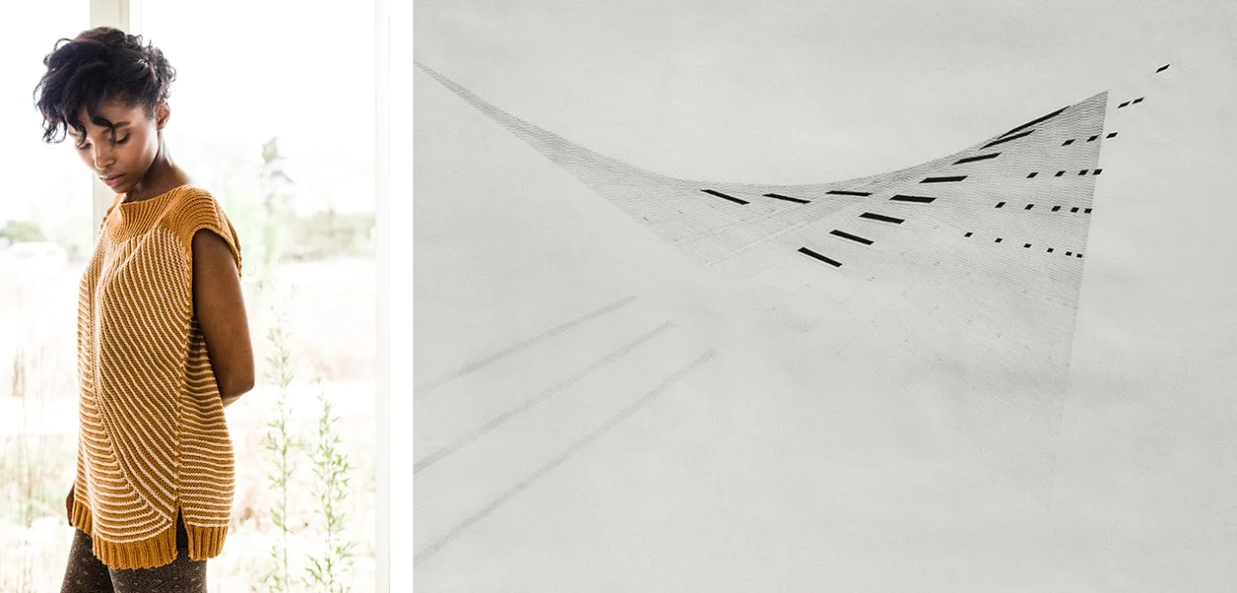
LEFT: Nasreen top by Lana Jois / RIGHT: Nasreen Mohamedi, Untitled
The intersecting diagonals and high contrast of Lana Jois’ modular-knit top Nasreen brought Nasreen Mohamedi (1937-1990) to mind. Her spare line drawings explore endless poetic combinations of lines made with just paper and ink, creating what she described as “the maximum with the minimum”. Mohamedi was ahead of her time and out-of-step with trends in India during her short life, so her work became appreciated more after her death. Now recognised internationally for her pioneering work, we are happy to add fanfare with our Nasreen! Pick a crisp yarn for defined stripes in high-contrast colours for this one.
TOP IMAGE LEFT: Anni Albers, Untitled Wall Hanging (1926) / RIGHT: Anni by Gina Röckenwagner
At a time when women fought to be accepted into serious art classes, let alone be recognized as great painters, Anni Albers switched her path from painting to textiles. By combining elements of painting and drawing with weaving, Albers established textile design as an artform in its own right. She became hugely influential (if largely unacknowledged) among other artists and remains among the most-studied textile artists in art history. The broken stripe stitch and knobbly texture of Gina Röckenwagner’s Anni tee made us think instantly of Anni Albers’ blocky woven patterns. Choose slightly muted colours with lots of contrast to recreate these palettes as well as a yarn that’s not too round or firm and has great drape so that the edges of the colour sections meet softly.
When you are stumped for a yarn or colour choice, try looking outside the knitting world for ideas. Painting, textile, and graphic design offer lots of clues for colour combinations and textural effects to incorporate into your knitting. Consider the plumpness, texture, and shine of the yarns, as well as the colours and how they blend together as stripes. Even the simplest patterns can be an opportunity for your inner artist to come out and play.
Thank you so much for another amazing post ladies! So good!!!
Don't forget to check out Pom Pom and their newest issue - Summer 2018. They also have a podcast and publish books too! So much goodness!

